How To Design Your Own Sidewalk Sign
By Naomi Myrick
Table of Contents
- Introduction
- Know Thy Audience
- Be Concise
- Be Diverse
- Be Friendly
- Text & Graphics Should Pair Well
- Know Thy Local Sidewalk Regulations
- Conclusion
 Introduction
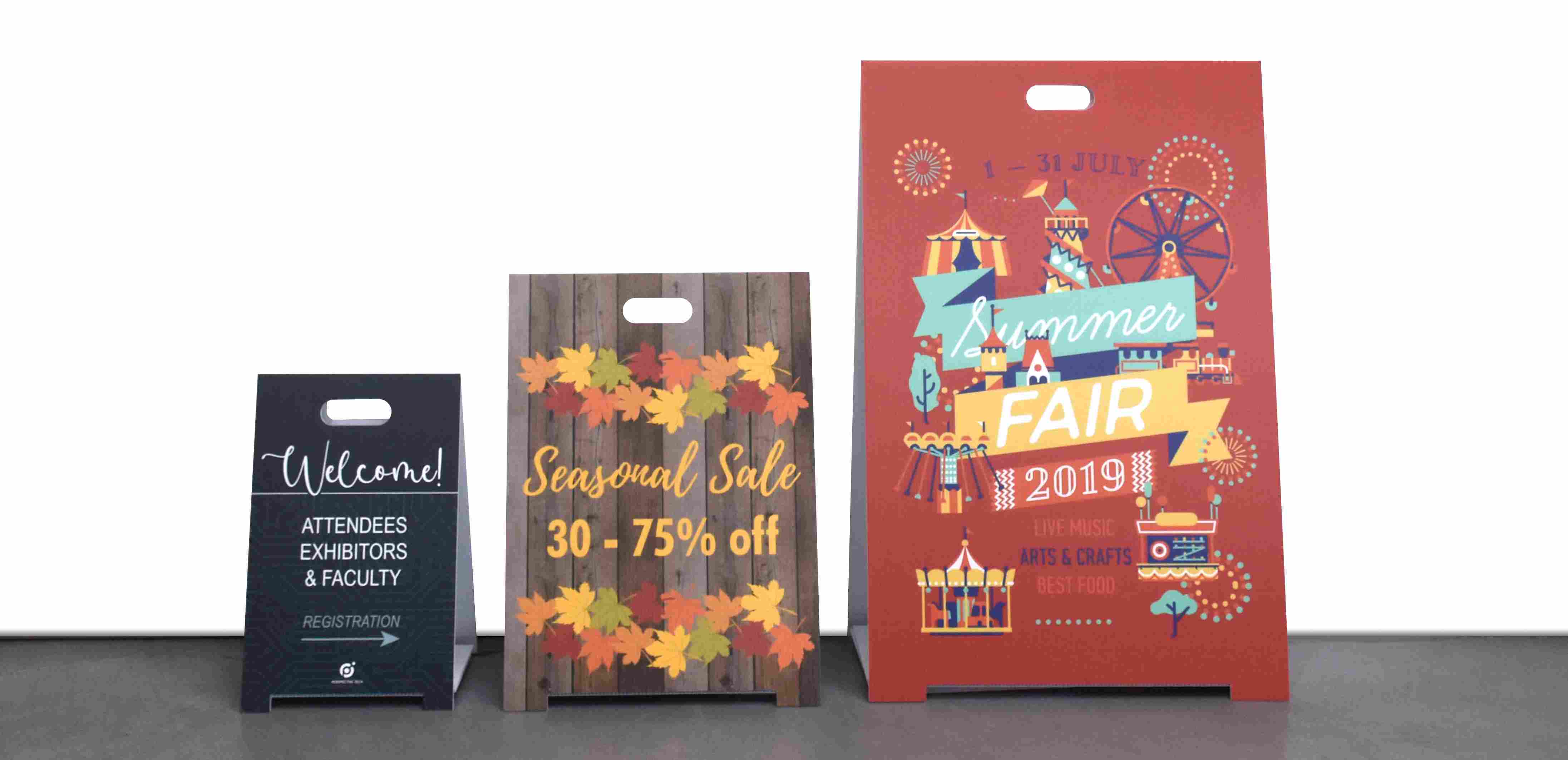
Think of a sidewalk sign or an A-Frame sign as your friendly, but quiet, salesperson. I would much rather walk by an inviting sign with a clear message than be followed around by a perfume sample lady trying to upsell me in-between sprays. The sidewalk sign should send a clear yet engaging message about your business.
There are a few things to consider when designing a sidewalk sign. Read on for some useful ideas!
Know thy audience
Advertising is just a psychology-based artform. And what do successful artists, authors, and actors all do? They know their audience. So, think about who your customer is, what their needs are, and what will gain their attention.
Be concise
I’m a power-walker and speeding by a wordy sidewalk sign would probably not draw my attention. However, speeding by a sidewalk sign that said “World’s best grilled cheese inside” well, now you’ve got me!
Envision the sign verbiage as a subject line for an email. The purpose of those precious less than ten words is to get someone to click and digest the information inside. Your sidewalk sign is trying to do the same thing, but instead of clicking, someone is opening the front door. This is the first step towards getting a new customer to spend their money at your store.
Be Diverse
Humans are complete creatures of habit even when they try not to be. People tend to take the same route, to the same job, at roughly the same time, every single day, and you can use that to your advantage.
Part of sidewalk sign design is knowing when and how to change it. Our eyes notice subtle changes, so frequent yet consistent message alterations will eventually draw the attention of someone routinely taking the same route.
Be friendly
Remember being a kid and how excited you were to see that favorite aunt or uncle because they’re just cool and fun to be around? Your sign should invoke a similar emotion — it should invite people in and make them feel welcome.
Any English teacher or job interviewer will tell you that a positive voice or a positive attitude is key. Positivity attracts positivity, so make sure your sign message uses upbeat language.
 Text and graphics should pair well
Now that you know who and what you’re designing your sign for, you can think about the actual design itself. Use logos on your sign sparingly. You have a storefront displaying your brand, so people likely know what kind of business you run.
However, keep your logo in mind when choosing a color scheme. An established color theme will emphasize your message and remind people who it comes from. Keep the design simple. Remember: People are quickly walking by, not necessarily looking for roses to sniff or signs to read.
Know thy local sidewalk regulations
After spending many hours and much thought, you’ve devised a unique, ingenious sidewalk sign only to be fined by the city a day later for the sign being an inch too high. So frustrating, right? While we may not always agree with zoning regulations or city ordinances, to function in a civilized society we must abide by these edicts. I don’t want to bore you with legalese, but I strongly advise being aware of your city or town signage regulations.
Conclusion
In closing, be personal and concise with your messaging, know thy audience, know thy sidewalk regulations and choose complimentary text and graphics. Remember that your sidewalk sign should be effervescent and diverse — a friendly and wonderful salesperson hanging out on the sidewalk.
Using our easy-to-use templates, you can create a custom sidewalk sign with high quality printing at Banners.com! Or, submit your own artwork and we can print it for you. A well-designed sidewalk sign can help you make the most of foot traffic outside your business.

Marketing Generalist
Naomi is a content creator and marketing generalist at Banners.com. She has a diverse background in sales and customer service, but her real passion has always been writing. She is originally from Minneapolis, MN. and is a recent transplant to central MN. Naomi enjoys fishing, hiking and loves hockey.