Impactful Church Signs: How to Reach Your Community

Introduction
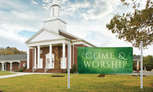
Church signage has been a longstanding tradition for congregations to communicate with their community. More than just a place to display worship service times, these outdoor signs and banner stands can inspire, inform, and invite engagement. Crafting effective custom church signs involves a blend of creativity, clarity, and strategy to effectively draw attention to your church. Here’s how you can master the art of creating outdoor church signs that make a meaningful impact.
1. Understand Your Audience
Before you begin designing your church sign, it’s crucial to understand who you are trying to reach. Consider the demographics of your community:
-
Residents: Are they young families, retirees, students, or professionals?
-
Visitors: Do tourists or people from neighboring towns frequently pass by?
-
Commuters: Is your church on a busy road where people drive by daily?
Tailoring your message to resonate with these groups will make your sign more effective.
2. The Message
The message is the heart of your sign. Here are some tips to ensure it stands out:
-
Keep It Short and Sweet: Messages should be concise, as people will only have a few seconds to read them. Aim for 8-10 words.
-
Inspire and Invite: Use uplifting messages or thought-provoking quotes. Scripture verses, inspirational sayings, or church event announcements work well.
-
Be Relevant: Tie your messages to current events or seasons. For example, during Easter, a message like “He is Risen! Join us for Easter Sunday Service” is both timely and inviting.
-
Humor and Wit: A clever or humorous message can attract attention and make people smile. Just ensure it aligns with the values and tone of your church.
3. Design Elements
A well-designed sign captures attention and conveys the message clearly. Consider the following design tips:
-
Font Choice: Use easy-to-read fonts. Sans-serif fonts are generally more legible from a distance. Avoid overly decorative fonts that might be hard to read.
-
Contrast and Colors: High contrast between text and background improves readability. Use colors that align with your church’s branding and that stand out well.
-
Size and Spacing: Ensure the text is large enough to be read from a distance. Proper spacing between words and lines enhances readability.
-
Graphics and Symbols: Simple graphics, such as a cross or a dove, can add a visual element to your sign without overwhelming it.
4. Location and Placement
Where you place your high-quality sign is just as important as what it says. Consider these factors:
-
Visibility: Ensure the sign is visible from the road and not obstructed by trees, buildings, or other signs.
-
Lighting: If your sign needs to be seen at night, consider backlighting or spotlights to make it visible after dark.
-
Height and Angle: Position the sign at a height and angle that makes it easy for drivers and pedestrians to see.
5. Change It Up
Regularly updating your sign keeps the community engaged and looking forward to new messages. Plan a schedule to change your sign weekly or bi-weekly. This keeps the content fresh and shows that your church is active and dynamic.
Conclusion
An outdoor church sign is more than just a communication tool; it’s an extension of your church’s presence in the community. By understanding your audience, crafting meaningful messages, paying attention to design, and keeping your content fresh, your church can create signs that inspire, inform, and invite everyone who passes by. The key is to use your eye-catching signs thoughtfully to share your church’s message of faith, hope, and love.
Check Out Our Blog
How to Design Graduation Yard Signs and Banners
Learn how to design graduation yard signs and banners to help celebrate you or your loved ones' big day!
Read more...
Common Vinyl Banner Sizes
Learn what sizes are typical for vinyl promotional banners. Choose from these common sizes, or order yours in a unique, custom size.
Read more...
Types of Banner Materials
Compare all 5 different banner materials available from Banners.com and decide which material is best for your custom banner.
Read more...
Go to Blog